Equity Navigator: A case study in designing for empowerment

Overview
“Knowledge is power, even within flawed systems.”
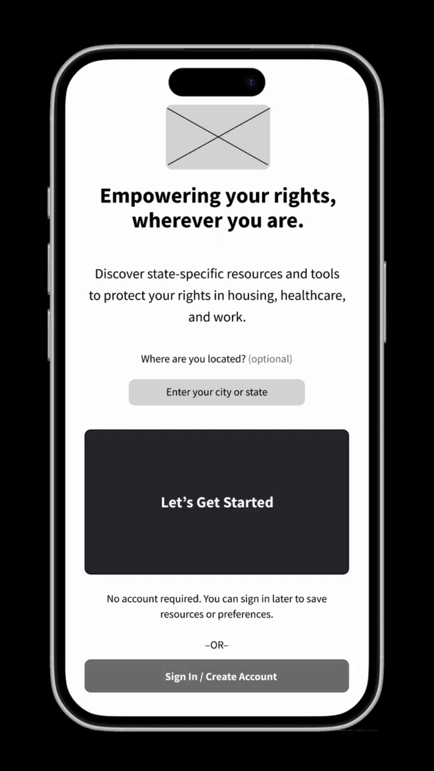
Navigating complex legal systems can be an overwhelming experience, especially for those already marginalized by systemic inequities. Equity Navigator provides a user-friendly platform offering location-specific guidance on key legal rights in housing, healthcare, and workplace protections.
While legal “rights” are not the ultimate solution to systemic injustice, they are an essential tool for asserting autonomy, seeking accountability, and resisting harmful systems. By providing accessible, actionable information, Equity Navigator empowers users to take informed steps toward security and advocacy, recognizing their agency within structures often designed to exclude them.
Problem
Marginalized individuals face systemic challenges when accessing their legal rights, from confusing jargon to resource gaps.
Goal
Design a mobile app that simplifies access to complex legal systems, offering tailored, location-specific guidance on housing, healthcare, and workplace protections. Equity Navigator aims to empower users with the knowledge and tools they need to navigate their rights.
My role
As the Lead UX Designer, I was responsible for:
User Research: Conducted empathy mapping, developed personas, and gathered insights to understand user needs.
Information Architecture: Structured content to ensure intuitive navigation and accessibility.
Wireframing and Prototyping: Designed wireframes and interactive prototypes to visualize and test the user interface.
UX Writing: Composed clear and empathetic language to guide users throughout the app.
Key features
Location-based guidance: Provides users with legal information relevant to their state or region.
Offline access: Allows users to download essential guides for use without internet connectivity.
Bookmarking and note-taking: Enables users to save important information and add personal notes for future reference and self-advocacy.
Documentation tools: Offers features for users to document incidents or interactions, supporting their legal needs.
User research: Who we’re designing for
Building the Equity Navigator app began with understanding the lived experiences of people navigating complex legal systems. To design a tool that empowers users navigating housing, healthcare, and workplace rights, I conducted deep research into user behaviors, emotions, and challenges. The goal was to uncover practical insights by identifying patterns in their frustrations, motivations, and priorities.
By using empathy maps, personas, user stories, and journey maps, I created a foundation to design a tool that is accessible, equitable, and impactful.
Empathy maps
Empathy maps allowed us to identify key emotional stressors and meaningful design opportunities. They clarified what users say, think, feel, and do when navigating complex legal systems.
Alex: Overwhelmed by legal jargon; needs quick access to state-specific workplace protections.
Jamal: Feels isolated in rural areas; worries about landlord retaliation and limited support networks.
Marisol: Fears hostile environments for her trans son; searches for affirming healthcare providers.


Personas
Personas helped center the design process on users’ lived experiences, ensuring the app addressed their specific needs. Each persona reflected a unique intersection of identity, location, and challenges.
Alex: Navigating workplace protections
Alex: A young LGBTQ+ professional seeking workplace protections in a hostile environment.
Jamal: Understanding rural housing rights
Jamal: A rural tenant facing housing insecurity and barriers to legal recourse.
Marisol: Advocating for her trans teen
Marisol: A mother advocating for her trans son while navigating rapidly changing laws.
User stories
User stories distilled key motivations and goals, guiding feature prioritization to align with user needs.
![User Story - Alex [Equity Navigator App].png](https://images.squarespace-cdn.com/content/v1/5c4b8079365f02de29e608ee/1737424025716-9X01HDSF39RS54KS1YLX/User+Story+-+Alex+%5BEquity+Navigator+App%5D.png)
![User Story - Jamal [Equity Navigator App].png](https://images.squarespace-cdn.com/content/v1/5c4b8079365f02de29e608ee/1737424025692-5PLHWZ1F9F8JXRQXDTNR/User+Story+-+Jamal+%5BEquity+Navigator+App%5D.png)
![User Story - Marisol [Equity Navigator App].png](https://images.squarespace-cdn.com/content/v1/5c4b8079365f02de29e608ee/1737424026454-9WHR22PUDSLJ0UZVRKXR/User+Story+-+Marisol+%5BEquity+Navigator+App%5D.png)
Journey maps
Journey maps mapped out users’ emotional and logistical experiences step by step. They highlighted feasible opportunities to streamline access to resources and reduce stress.
![Journey Map - Alex [Equity Navigator App].png](https://images.squarespace-cdn.com/content/v1/5c4b8079365f02de29e608ee/1737424305950-WHDCHLT1GBZ6E2ATVI9M/Journey+Map+-+Alex+%5BEquity+Navigator+App%5D.png)
![Journey Map - Jamal [Equity Navigator App].png](https://images.squarespace-cdn.com/content/v1/5c4b8079365f02de29e608ee/1737424305965-R7Y9IEBH8MKTNE441GJO/Journey+Map+-+Jamal+%5BEquity+Navigator+App%5D.png)
![Journey Map - Marisol [Equity Navigator App].png](https://images.squarespace-cdn.com/content/v1/5c4b8079365f02de29e608ee/1737424306757-HORT0C1Y4C0IX94RQKOL/Journey+Map+-+Marisol+%5BEquity+Navigator+App%5D.png)
Key insights
Through these methods, I uncovered critical insights:
Legal systems overwhelm users under stress.
Countermeasures must distill complex information with plain language and empowering interfaces.
Intersectional challenges shape user experiences.
Designing for identity, location, and accessibility is key to equity-driven outcomes.
Trust is a barrier to action.
Users need vetted, credible resources to feel confident acting on their rights.
Defining the problem
To focus the design process toward meaningful and practical solutions, I synthesized insights from user research to clearly frame the challenges users face. By understanding their needs, frustrations, and goals, I established a foundation for impactful, achievable features and functionality.
Designing for equity and accessibility requires acknowledging the broader systemic contexts that shape individual experiences. Many of the challenges faced by users stem from entrenched inequalities in housing, healthcare, and workplace protections. While these problems are systemic, design solutions must be both adaptable and deeply empathetic, addressing the immediate needs of individuals without losing sight of the larger structures at play.
By framing these systemic challenges as opportunities for user-centered design, I was able to focus on empowering users within the constraints they face. The goal was to provide clarity, accessibility, and confidence in moments when navigating rights and resources can feel daunting.
Problem statements
Based on the personas and their unique challenges, I wrote clear and user-centered problem statements to anchor the design process. Each problem statement reflects the intersection of user pain points and design opportunities.

Goal statements
Each problem statement translated directly into actionable design goals. These goals kept the project grounded in user needs and helped prioritize design decisions.

Alex
Goal: Empower Alex to confidently navigate workplace protections with clear, jargon-free legal resources.

Jamal
Goal: Ensure Jamal can access housing rights information tailored to rural communities, even offline.

Marisol
Goal: Support Marisol with up-to-date, actionable tools for advocating for her trans child in healthcare and education.
Key challenges
The following challenges informed the app’s overall design strategy:

By framing the problem and goals clearly, I ensured that the design process stayed user-centered, focused, and actionable.
From sketches to wireframes
To inspire meaningful ideas for Equity Navigator, I employed creative methods to explore a variety of design possibilities. By focusing on user needs and their diverse contexts, I ensured the concepts aligned with the app’s mission of equity, simplicity, and empowerment. These methods allowed me to channel user insights into viable design ideas, while keeping the complex needs of marginalized communities at the forefront.

Creative thinking methods
How Might We (HMW) Questions
I reframed user challenges as concrete design opportunities through the “How Might We” framework. This approach encouraged me to view systemic barriers and individual experiences as opportunities for meaningful user empowerment.
Examples of HMW Questions:
How might we provide clarity without oversimplifying complex legal systems?
How might we connect users to trusted resources while respecting their privacy?

Framing systemic challenges as opportunities for innovation.
Rapid Sketching Techniques
To explore multiple solutions quickly, I used a method of sketching many interface concepts in minutes. This process emphasized speed, creativity, and flexibility while scouting potential remedies for key user needs.


Exploring multiple interface layouts for empowering users.
From sketches to wireframes
Building from these activities, several strong ideas emerged:

Personalized State-Specific Resources: A location-based interface offering clarity on users’ rights for housing, healthcare, and workplace protections.

Documentation Tool: A multifunctional feature enabling users to record, save, and share instances of rights violations while maintaining privacy.

Offline Access: Resources downloadable for areas with limited connectivity, ensuring accessibility for rural users.
After exploring ideas through rapid sketching, I created paper wireframes to test early layouts…


… before moving into digital wireframes in Figma to explore layout and interactions. These wireframes focused on structuring key pages and ensuring usability before adding interactivity.


From wireframes to prototypes
Once the wireframes were in place, I transformed them into low-fidelity prototypes in Figma, adding basic interactivity to test user flows. This allowed me to evaluate whether users could efficiently find resources, log documentation, and adjust accessibility settings.
Prototype in action
Here’s a walkthrough of the core user flow, from home to saved resources to log.
Usability testing & key insights
To ensure the Equity Navigator prototype was intuitive and accessible, I conducted usability evaluations inspired by real user needs. The goal was to test navigation clarity, accessibility features, and ease of documentation.
📍 Goal: Assess how well the lo-fi prototypes met user needs.
📍 Method: A structured heuristic evaluation using insights from key personas.
This phase identified navigation issues, accessibility needs, and usability challenges, leading to improvements.
Affinity diagram
Synthesizing usability feedback into key themes for design improvements.
Key findings & design updates
✅ Search needed better filtering
→ Refined search results with clearer categories and tags to help users find protections faster.
✅ Privacy settings lacked clarity
→ Improved labeling and descriptions for browsing anonymity, ensuring users understand how their data is handled.
✅ Legal language toggle needed improvement
→ Added guidance on how “Plain Language” mode works to reassure users that it simplifies legal terms without losing critical meaning.
✅ Documentation tool categories were unclear
→ Introduced predefined category examples and improved visual hierarchy to help users organize their logs more intuitively.
✅ Offline access was important
→ Added an offline indicator to saved resources and optimized downloads for better accessibility in low-connectivity areas.
Final high-fidelity designs
In-progress. Thanks for your interest.
Takeaways & next steps
This project is ongoing; interactive user flows (lo-fi and hi-fi prototypes) will be added soon. Next steps: Refining the high-fidelity prototype and implementing usability insights.